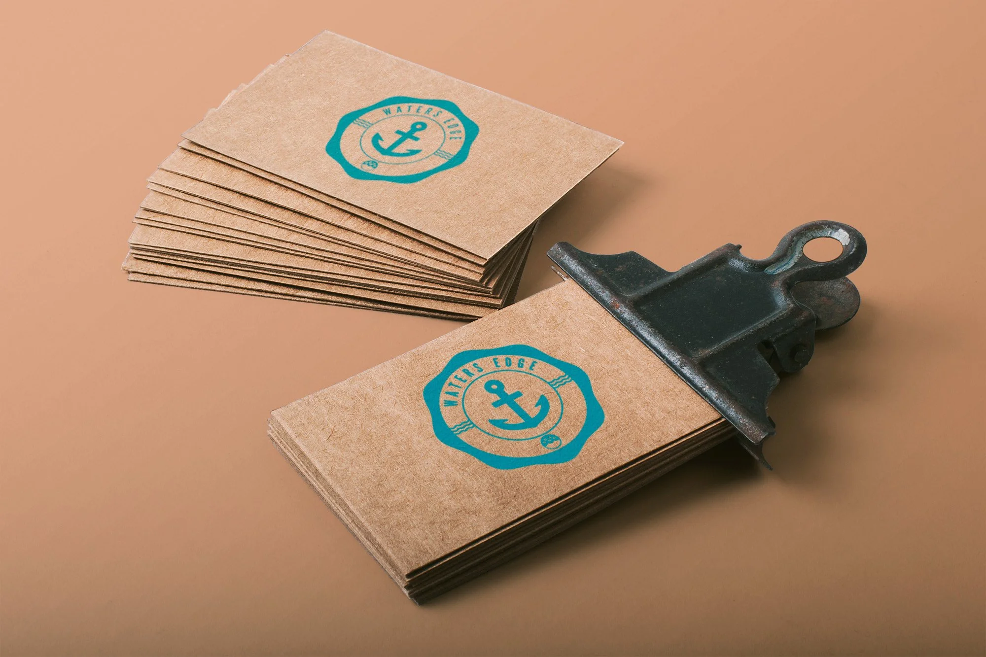
Waters Edge Church Branding
A good friend of mine likes helping folks on the beach. He needed a logo for his ministry and requested an anchor shape be used. So, focusing on the name, the environment, and taking the anchor shape, these are the results. We are still in the process of narrowing one down. Which is your favorite?
Role
Visual design
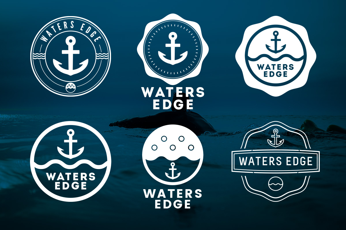
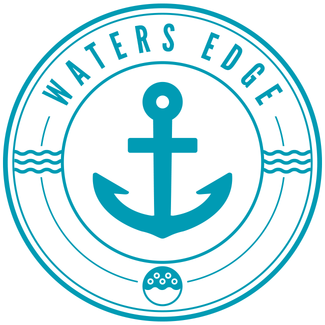
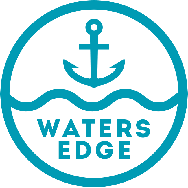
One - Anchor & Waves
Logo One takes cues from football crests, incorporating the requested anchor, yet also wave shapes that connect the ministry to its beach home.
Two - Waves are Up
Logo Two introduces a wavy shape to the main background seal. Allowing the logo to stand on its own allows for a larger word mark.
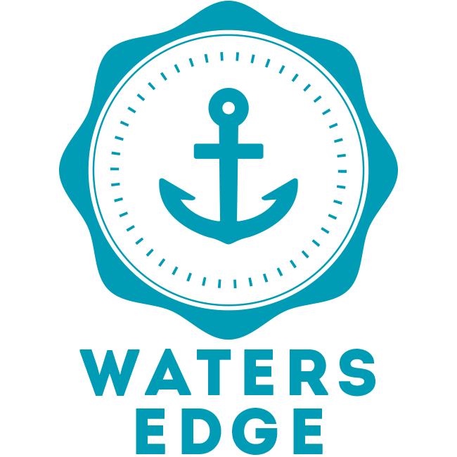
Three - Double Set
The main seal carries the wavy shape again and another wave is represented within the logo.
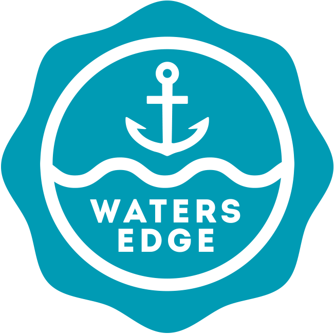
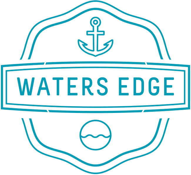
Four - Simplifying
Number Four removes the background seal of Three and allows for a stronger, line art approach.
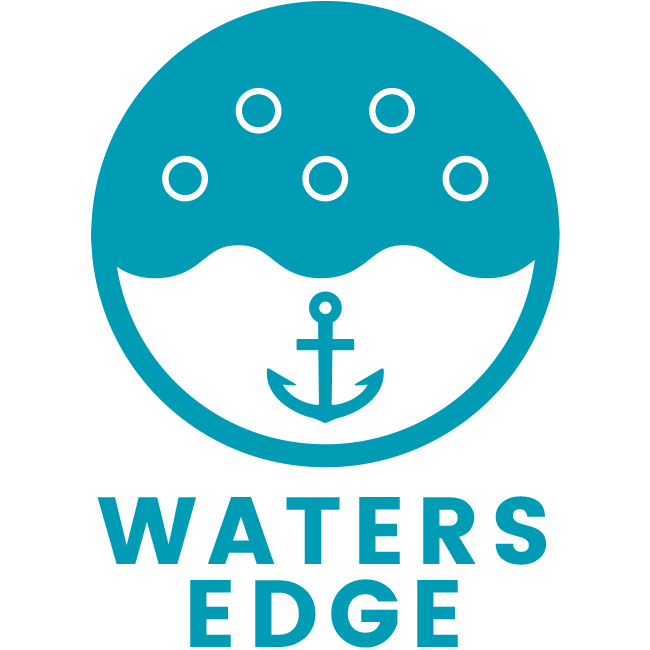
Five - Bubbles!
Always look for the bubbles rising when you go under.
Six - Clean Lines
Logo Six takes a line art approach, with some slight variations in weight.